When starting a real estate website, one of the first goals agents will try to accomplish is generating a high volume of traffic. The more visitors you have, the more likely those visitors will translate into sales leads, right?
Well, as many real estate agents with a website may have discovered, attracting a high volume of traffic is only the first step in building an online presence that will start producing the kind of results you need out of your site.

Call to action buttons are vital to your site's success © Denys Rudyi ' Fotolia.com
Once you achieve that coveted high Page Rank and start seeing a larger volume in site visits and unique visitors, your next priority should be to convert those visitors into quality sales leads. And what's the best way to do that? The answer, believe it or not, is actually easier than you may have originally expected.
Call-to-action buttons are one of the most important aspects of any website; and a real estate website is certainly no different. The idea behind call-to-action buttons is to basically direct the flow of your real estate website by using attractive color schemes and graphics, all while persuading possible home buyers to take action by clicking on a web page or home listing.
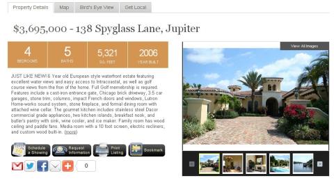
Some attractive and useful ways to use call-to-action buttons on a real estate website can be seen on the detailed listing pages at The Snyder Group's real estate website in Jupiter, Florida. When clicking on a home listing, notice that just below the property information are several call-to-action buttons that prompt viewers to schedule a showing, request information, print the listing, or even bookmark the listing'should they want to come back to view it at a later time.

Snyder Group's call to action buttons
While viewing each and every listing, at no time do potential home buyers have to wonder how to get in touch with an agent or wonder how to request more information about a property. In addition, at the bottom of the listing page are other 'Similar Property' call-to-actions that allow home buyers to easily keep searching real estate in a continuous motion without clicking the 'Back' button or trying to manually navigate the website themselves.
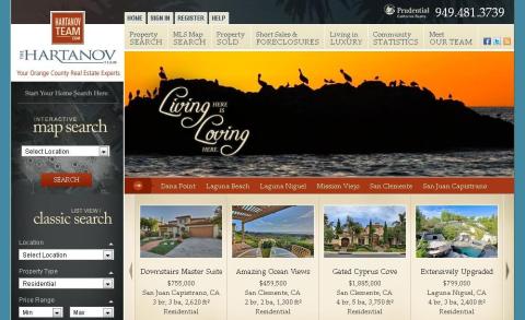
Similarly, the listing pages on the Hartanov Team's website out in California have a very practical call-to-action button that is designed to entice viewers to use the Hartanov Team to sell their home. Because a large percentage of homebuyers searching real estate already own a home, why not try to reel those clients in as both home buyers AND home sellers?

The Hartanov Team's site is designed to entice homeowners to sell as well as buy
Again, the idea behind call-to-action buttons on your real estate website is to help users navigate the site, but more importantly, encourage and remind users to take action'ultimately improving the conversion rate of website visitors to registered sales leads. It's these subtle, yet crucial aspects of a website that go a long way in making sure home buyers out there contact YOU and not the competition.
How are you using call-to-action buttons on your real estate website? Comment and give us some examples of what you see working on your real estate site!
0 komentar:
Posting Komentar